




The transition from scholarly inquiry to actionable community intelligence represents a significant hurdle for many academics engaged in participatory action research. When researchers collaborate with community stakeholders—such as tenant advocates and housing-precarious residents—the final report serves as more than just an academic archive; it acts as a primary tool for policy reform and grassroots advocacy. The challenge lies in translating dense, multi-year findings into a format that resonates with non-academic partners who possess deep lived experience but may not interact with traditional scholarly registers. Experts in research communication suggest that the key to this transition is not merely simplifying language, but re-engineering the visual and structural architecture of the report to prioritize accessibility, relationality, and long-term utility.
The Shift from Scholarly Output to Community Resource
For many urban planners and social scientists, the final report is often the conclusion of a years-long feedback loop. In participatory projects, research questions are typically co-designed with stakeholders, meaning the final document is technically owned by the community as much as the institution. However, academic writing often favors nuance and hedging, which can obscure the direct findings that organizers need to secure funding, challenge local ordinances, or demand legislative change.
The necessity of this shift is underscored by the current climate in urban policy, where data-driven advocacy is becoming the gold standard for neighborhood development. When a research project concludes, the "fixed" nature of a report creates a paradox: it must be precise enough to withstand scrutiny from policymakers while remaining digestible enough for a tenant living in a precarious housing situation to read, understand, and cite.
Chronology of Collaborative Research
The typical trajectory of a long-term participatory project involves several distinct phases that culminate in the final reporting process.
- Phase One: Scoping and Relationship Building (Years 1-2): Researchers and community partners establish the research agenda. This phase focuses on identifying the most pressing issues—such as rising eviction rates or building safety violations—and securing trust.
- Phase Two: Data Collection and Iterative Review (Years 2-3): Fieldwork is conducted. In a high-functioning participatory model, findings are shared periodically with the coalition to ensure that the researcher’s interpretations align with the participants’ lived realities.
- Phase Three: Synthesis and Formatting (Final Months): The researcher moves from data collection to report generation. It is at this stage that the "translation" of findings into visual and narrative form occurs.
- Phase Four: Dissemination and Application: The report is released to the public, city officials, and local media. Success at this stage is measured by how effectively the report is utilized to influence local policy.
Data-Driven Visualization: A New Standard
Visual communication is increasingly recognized as a vital component of research literacy. Alana McPherson of Research Visualization Specialists emphasizes that visuals are not mere decorations but are essential for practicing accountability.
Data suggest that visual aids significantly increase information retention. According to various pedagogical studies, adults presented with information through a combination of text and visuals demonstrate a 42% higher retention rate compared to those who consume text alone. In the context of housing justice, a simple line chart showing the trajectory of rent increases over a five-year period is rarely enough. The most effective reports—as identified by community organizers—combine these quantitative trends with qualitative markers, such as specific dates of policy changes or anecdotal evidence of household budget shifts.
Strategic Visual Design Principles
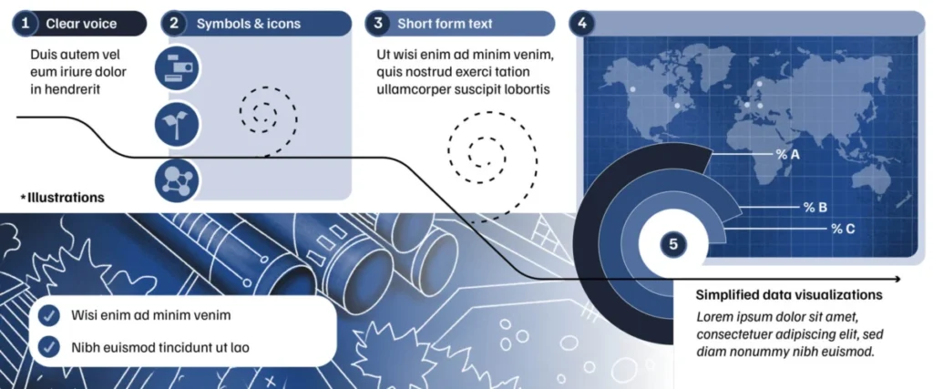
To ensure that complex data is accessible, researchers are encouraged to adopt three primary design strategies:

1. Sequential Narrative Flow
Borrowing from the logic of sequential art, such as comics, reports should guide the reader through an argument. Rather than presenting a disjointed collection of charts, researchers should use motifs—such as recurring icons or a consistent color palette—to link disparate findings. If the report begins with a finding on power imbalances, subsequent visuals should bridge that gap to show how those imbalances manifest in specific housing barriers.
2. The Multi-Entry Point Approach
Diversity in the audience requires diversity in presentation. A single finding should be presented through a tripartite lens: a simplified data visualization (like a chart), a brief textual summary, and a human-centric element (such as a direct quote or an illustration). This ensures that a policy expert and a tenant advocate can both find a point of entry that suits their preferred mode of information processing.
3. Contextualization of Statistics
A common pitfall in research reports is the presentation of data in a vacuum. A 30% increase in eviction filings is a statistic, but it becomes a narrative when placed against the backdrop of local utility hikes or regional economic shifts. By including comparison points—such as data from neighboring jurisdictions or historical markers—researchers provide the "why" alongside the "what," allowing community partners to construct a more compelling argument for their stakeholders.
Institutional Reactions and Broader Implications
The push for more accessible research reporting is gaining traction within academic institutions. University departments are increasingly integrating community-facing design workshops into their research methodology training. This is a direct response to feedback from community organizers who have, in the past, criticized academic reports for being "ivory tower" documents that provide little practical utility for on-the-ground activism.
"If the people who made the research possible cannot use the final document, the project has failed its primary ethical obligation," notes one anonymous community advocate involved in local urban planning initiatives. The implication is clear: the future of participatory research is inextricably linked to the researcher’s ability to act as a translator of complex data.
The Role of Professional Design
While many researchers attempt to manage report design independently, the complexity of visual hierarchy—the deliberate use of size, color, and proximity to direct a reader’s eye—often warrants professional assistance. Graphic designers specializing in research communication help bridge the gap between technical data and human impact. By outsourcing the design, researchers ensure that the "visual hierarchy" of their report is not accidental, but deliberate, ensuring that the most critical information receives the most prominent placement.
Conclusion: Measuring Success
The success of a final report in a participatory project is rarely measured by its citation count in academic journals. Instead, it is measured by its impact on the community. Has the report been used in a city council meeting? Has it helped secure a tenant protection ordinance? Did it provide the necessary data for a community group to win a legal challenge?
For the researcher, the process of report writing is an exercise in relinquishing control. By moving from a "scholarly-first" mindset to a "community-first" approach, researchers ensure that their work lives on as a dynamic, usable tool. As the demand for transparency and public accountability grows, the ability to effectively translate research into clear, accessible, and context-rich documents will become an essential skill for the modern researcher, ensuring that the labor of community partners is honored through meaningful and lasting change.