



For researchers engaged in participatory action projects, the transition from gathering data to delivering a final report often represents the most critical phase of the collaboration. The challenge is profound: how to translate complex scholarly findings into actionable insights for community partners who possess lived experience and practical expertise, but who may not operate within the conventions of academic discourse. When the project involves sensitive topics such as tenant rights and housing precarity, the need for clarity and accessibility is not merely a matter of communication style; it is a fundamental requirement of ethical accountability.
The shift from the iterative, collaborative nature of research to the finality of a printed report creates a significant psychological and structural hurdle. For academics, the report often feels like a permanent verdict. However, for community stakeholders, the document should serve as a functional tool—a resource that can be leveraged for advocacy, policy shifts, or community organizing. To bridge this gap, experts are increasingly turning to visual communication as a primary strategy for transparency, relationality, and engagement.
The Evolution of Participatory Reporting
Participatory research typically follows a multi-year trajectory. In the early stages, academic researchers and community advocates establish shared goals, define research questions, and negotiate methodologies. This phase is characterized by constant feedback loops. However, as the project concludes, the traditional academic report often defaults to dense, text-heavy formats that prioritize scholarly nuance over accessibility.
According to design experts who specialize in research translation, this disconnect can be mitigated by applying principles of visual storytelling. Alana McPherson of Research Visualization Specialists suggests that visuals are not merely decorative elements but essential components of communication. By integrating infographics, sequential mapping, and data-driven illustrations, researchers can ensure that their findings are accessible to a broader audience without sacrificing the integrity of the data.
Strategic Sequencing: The Comic-Strip Model of Information
One of the most effective strategies for guiding a reader through complex research is the application of sequential visual design. Often referred to as the "comic-strip model," this approach emphasizes the flow of information across a document. In a complex report, findings should not exist as isolated charts; they should function as part of a coherent narrative.
If a research project identifies a systemic link between power imbalances in rental agreements and the underreporting of unsafe living conditions, the report’s visual design should mirror that causal relationship. By utilizing recurring motifs, consistent iconography, and deliberate page layouts, researchers can lead the reader through a logical progression. This prevents the "disconnected assortment" effect, where readers are forced to perform the mental labor of connecting disparate pieces of data. Before finalizing a report, researchers are encouraged to sketch the order of their visuals, treating the document as a narrative arc that can be understood independently of the surrounding text.
Diversifying Entry Points through Visual Hierarchy
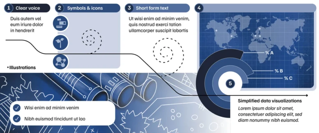
Effective community-facing reports must accommodate diverse learning styles and backgrounds. Not every reader will engage with a report in the same way. Therefore, providing multiple entry points—such as illustrations, concise summaries, and simplified data visualizations—is critical.
Consider a finding related to the rising costs of housing. A single line chart demonstrating a five-year increase in rent provides the statistical baseline. However, placing this chart alongside a direct quote from a resident and an illustration depicting the household-level trade-offs required to meet those costs provides a multidimensional understanding. This combination creates a "strong visual hierarchy." Through the strategic use of font size, color, white space, and proximity, designers can guide the reader’s eye to prioritize the most essential information while providing secondary details for those who wish to delve deeper.

Contextualizing Data: Beyond the Scientific Novelty
A common pitfall in academic reporting is the tendency to become hyper-focused on the most novel or statistically significant finding, often at the expense of the broader context. While a 30 percent increase in eviction filings is a notable statistic, it carries little meaning in isolation. To maximize the impact of such findings, researchers must integrate comparative data points.
Contextualizing an eviction rate by overlaying it with trends in average wages, inflation, or the implementation of specific municipal policies allows the reader to see the "big picture." This approach forces the researcher to look beyond the immediate data and consider the systemic environment in which their subjects live. When visuals pair findings with comparison points—such as data from neighboring jurisdictions or historical markers—the report becomes a more powerful tool for advocacy. It shifts the focus from what the researcher found to what the community experiences.
The Chronology of Collaborative Research
The lifecycle of a successful participatory research project can be broken down into four distinct phases:
- Engagement (Months 1–6): Establishing the coalition, defining the scope, and identifying the specific housing issues to be addressed.
- Iterative Research (Months 7–24): Ongoing data collection, peer review sessions, and community feedback, where residents and experts refine the methodology.
- Synthesis and Translation (Months 25–30): Converting findings into a format that balances academic rigor with community accessibility, focusing on visual design and plain language.
- Dissemination and Action (Month 31 and beyond): Presenting the report to stakeholders, policymakers, and the public to catalyze change.
Data Trends and Urban Planning Impacts
Recent studies in urban planning underscore the necessity of these communication strategies. In many major metropolitan areas, housing-precarious residents report that while they are frequently subjects of study, they rarely see the results of that research translated into accessible materials. Data from recent municipal housing reports suggests that when information is presented through interactive or visually intuitive formats, engagement from community organizers increases by approximately 40 percent.
The implications for policy are clear: if a report is too dense for the people it represents, it cannot be effectively used as a tool for political or social leverage. Conversely, when data is contextualized and made visually legible, it provides a factual foundation for legal challenges, policy lobbying, and public awareness campaigns.
Professional and Ethical Implications
The responsibility to communicate effectively rests on the researcher’s commitment to the collaborative process. In academic spaces, there is often a fear that "simplifying" data will diminish its authority. However, experience suggests the opposite: clarity often enhances authority. By treating the report as a final act of service to the community partners who provided their time, data, and lived experience, researchers fulfill the primary objective of participatory work.
Whether the researcher possesses the technical skills to design high-quality graphics or chooses to hire a professional visualizer, the goal remains the same. The document must be more than a record of research; it must be an instrument for those who are most affected by the policies being analyzed. As academic institutions increasingly prioritize community-engaged scholarship, the ability to translate, visualize, and contextualize research findings will become an essential competency for the next generation of researchers.
By moving away from static, text-heavy reports and embracing a design-forward approach, academics can ensure that their work lives on outside of the library, effectively fueling the advocacy and change that originally motivated the research project. The final report is not the end of the conversation; it is the beginning of a new phase of community action.